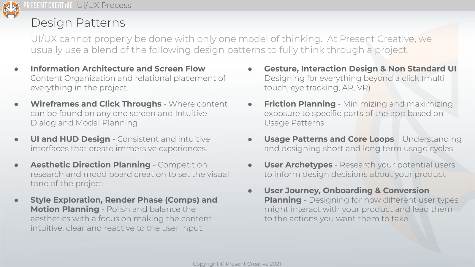
I developed and codified the UI/UX methodology used across all Present Creative client engagements. It was the operating standard for any UI/UX work we did. We had clients ranging from Disney, EA, Zynga, Google, Microsoft, and dozens more. This framework was developed over the years from best practices of documenting and locking down UI/UX so all teams knew what was being made and the stakeholders had continuous visibility of what was being built.
The deck above is the section header from the client-facing version. The pages that follow break each stage down with deliverables from real engagements.
Information Architecture and Screen Flow

Before any pixel was pushed, every product got an IA map: every screen, every transition, every modal, every state. Sometimes the client supplied this; more often, we extrapolated it from a development doc or a live game. Either way, the IA map became a backbone document that engineering, design, QA, and production could all point at and talk about in the same language.
User Journey and Core Game Loops

Information architecture shows you what screens exist. The user journey shows you what users do on those screens over time, first session through habituated use. The core loop diagram above is from a real engagement: the central feedback cycle that turned a one-time visit into a returning user. Every project got one of these, and every one was different.
Wireframes and Click-Through Tests

Once the IA was settled, we built wireframes for every screen, including dialogs, pop-ups, and modal states, on the actual device the user would encounter them on. In some cases the wireframes went straight to engineering so they could build in parallel with the design team. In others, a quick click-through was assembled for early on-device testing in real context. Either way: navigable structure before any visual treatment.
Aesthetic Direction and Render Phase

After mood boards and style exploration locked the visual direction, we built out the complete set of comps. This is the full render phase for a single project: title, gameplay, scoring, end states, all consistent, all final. The deck went to client review as a single coherent body of work rather than a stack of one-off frames.
Engineering Handoff

The last stage was the one most studios skip. Engineering teams have wildly different ideas about what a clean handoff looks like, some want pre-sliced PNGs in a particular folder structure, some want a documented spec, some want hands-on implementation help. We adapted to whichever team we were handing off to, and we measured ourselves on whether the build matched the comps once it shipped, not on whether the comps looked good in the deck.
How it was used
The process deck became a client-facing document. We onboarded new partners into it, here is how Present Creative approaches design problems, here is the order we work in, here is what you can expect to see at each stage. It set expectations early and gave clients a vocabulary for engaging with the work.
Internally, it gave the team a shared scaffolding. Designers knew which stage they were in, what was in scope at that stage, and what feedback to ask for. It made the work legible to everyone involved, designers, producers, engineers, and stakeholders.
Why it mattered
UX work without a methodology is a series of intuitions defended in meetings. With a methodology, intuitions get tested at the stage where testing is cheap, and the work that ships is grounded in something more durable than taste. The clients we worked with were not buying screens; they were buying the discipline behind the screens. The process was the product.