I started using Claude Desktop seriously and eventually couldn’t stop thinking about what it was missing.
Not the AI. The AI is remarkable. The container around it.
Claude Desktop today is a chat list. You open it, you see your conversations in a column, you start a new one or pick up an old one. That works fine for a chatbot. It doesn’t work for something that’s starting to run scheduled tasks, manage multiple projects simultaneously, and operate autonomously while you’re doing something else.
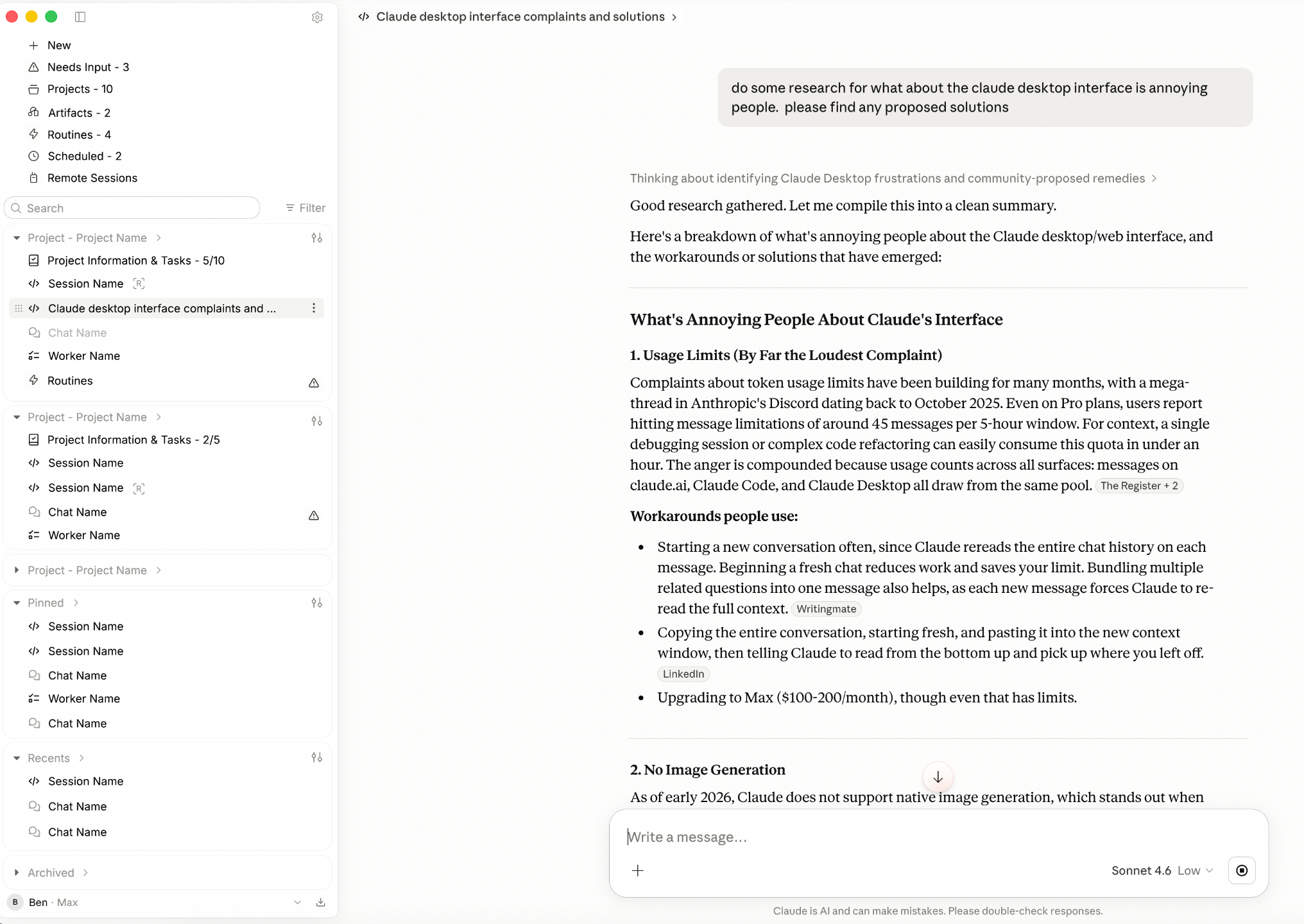
So I redesigned it. The screenshot above is the working prototype. The session open on the right is a research task I’d assigned, the tool was actively being used to understand its own problems while I was building the thing meant to solve them.
Where the current app falls short
Before designing anything, I spent time annotating what was actually bothering me about the existing interface.

Small things that compound. The drop shadow on selected items creates visual noise. The scroll handle sits too close to the edge. These aren’t the main problems, they’re symptoms of an interface that was designed for a simpler version of what Claude does.
The bigger issue is structural. Every conversation lives at the same level. There’s no concept of projects containing work, agents running tasks, or anything needing your attention. It’s a log, not a workspace.
The redesign: sidebar
The first thing to fix was the organizational structure.

The sidebar in the redesign organizes around projects. Inside each project you see sessions (active Claude conversations), chats (lighter exchanges), workers (agents running tasks), and routines (recurring scheduled work). Everything has a type. Everything has a status.
A few specific decisions:
Needs Input surfaces as a count at the very top. When an agent hits a blocker and needs a human decision, it doesn’t get buried in a thread, it becomes a queue item. That single change converts the interface from a log into something closer to an inbox.
Remote Sessions gives the app a concept of Claude doing work somewhere else, not just in the window in front of you. As MCP workflows mature, you need visibility into what’s running that you’re not actively watching.
Manual reordering within projects lets you drag sessions into priority order. Small thing. Meaningful difference between a list and a workspace.
Global filter and sorter at the top of the project list lets you cut across everything, show only things that need attention, or sort by recency across all projects at once.
The redesign: project view
The sidebar isn’t the only new surface. Clicking into a project opens a dedicated view.

Each project has a brief, a pinned context block at the top that Claude can reference. Below that is a task list with completion tracking, linked sessions, and a right-side toolbar for project-level actions. The project view makes it possible to manage work across multiple conversations without losing the thread between them.
Building it
The mockup became a working prototype. React and Vite, live API connectivity to Claude via a dev proxy, Anthropic’s actual brand tokens throughout. It’s not a Figma frame. It runs.
Here’s an earlier build state, showing the prototype in the browser before it was packaged as a desktop app:

The annotations here are active bug notes from the build process, missing dropshadow on the title bar, padding issues on the scroll handle, items getting clipped. This is what the work actually looks like in the middle of it.
The full write-up, what this suggests about where AI interfaces need to go, and the gap between how Claude is designed and how people are actually using it, is on Substack.